Solved

Survey UI - Current color controls and response line creating user confusion

  • 27 January 2017
  • 5 replies
  • 61 views

Badge
In the past few months, we have received feedback from our customers that the color box around the question + the "writing" line below the question has caused confusion for our customers. They tend to click the grey box versus the line below the question.


(We understand this information (name/email) would be captured if sent through co-pilot, but that isn't an option for the current workflow. An advisor sends an anonymous survey link as part of a post-meeting follow up.)


This leads customers to respond to us saying they are unable to fill out the

survey. It's definitely a bummer when we have someone engaged enough to

complete the survey who does not because it appears to be too

complicated. Unfortunately changing the color of the survey seems to

make it even worse.


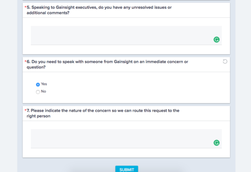
Customer are clicking here:


Rather than here:


icon

Best answer by praneet 30 January 2017, 19:27

View original

5 replies

Hi Nora,

Thanks for your feedback, With winter release we will have the fix for Question UI issue, where question and answer area looked separated and caused confusion to end user.

Please see below screenshot for the same, do you think this will resolve the confusion?

Badge
Thanks Praneet -- I reviewed with the team and we believe it will help tremendously. Thanks for the follow up...  #winning
Userlevel 7
Badge +4
Hi Nora, I've added our product manager for Surveys to this thread for his awareness.


I was also wondering if you've considered including some instructions in the Description area? Something along the lines of, "Please click in the white space below the question to enter your response."
Badge
Thanks Lila -- I'll pass along the idea to the team... but we all know, not everyone reads instructions 🙂
Userlevel 6
This reply was created from a merged topic originally titled Confusion on where to input survey responses - they're clicking the grey box/not ....


Box posted 3 items in Community on their surveys last week.  Are any of these "pebbles"?  


In particular the first item which is feedback that they have received from their customers that the color box around the question + the "writing" line below the question has caused confusion. Customers tend to click the grey box versus the line below the question so they are emailing saying they are unable to fill out the survey (basically because they can't tell where to type the response).  Really a bummer that they have folks engaged and wanting to reply & share feedback but aren't able to quickly figure out the UI.  Thanks!  


  1. https://community.gainsight.com/gainsight/topics/survey-ui-current-color-controls-and-response-line-creating-user-confusion
  2. https://community.gainsight.com/gainsight/topics/survey-admin-ux-add-ability-to-reorder-survey-pages
  3. https://community.gainsight.com/gainsight/topics/survey-remove-description-on-thank-you-page

Reply