
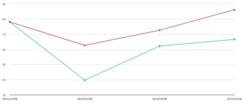
It would be useful to be able to set this to 0 as false origins can lead to misleading data presentation.
Oddly, this doesn't happen with bar charts.
Does anyone else see this as a problem?
If you ever had a profile with us, there's no need to create another one.
Don't worry if your email address has since changed, or you can't remember your login, just let us know at community@gainsight.com and we'll help you get started from where you left.
Else, please continue with the registration below.
Enter your E-mail address. We'll send you an e-mail with instructions to reset your password.

Are there any special cases where you want to see an axis start at a false origin?
OR
Would you prefer the y-axis always starting at zero?
Thanks for posting
I can't think of a recent graph when I've used a false origin but it would be good to still have the option in case it's requested by our exec team. Generally though, I would prefer it starting at zero as default.
For example, if you wanted to show quarterly renewal percent and the values ranged between 92 and 95 percent. If you represented those values on a chart with a zero y-axis start point, they would all look close to identical, but if your y-axis ranged from 90 to 100, you'd see a much better distinction with the quarterly values.