
Hey!
The new guage chart is great, but it could do with some extra features please.
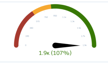
Some items missing are:
- the needle itself
- the data range for the guage (0, 190, 380, 570 etc..)
- the current value and %
- Maybe what the values are for “red vs yellow vs green”
example from the salesforce guage included below as a good example
as a side note, we have noticed that when we use the guage object in a dashboard, it displays poorly and is very small

It would be great to have this implemented! We are looking to be able to set up the same widget as the default NPS widget. We’d like the needle to be shown; also the last two responses added in the custom KPI widget.