Colour of Red / Amber / Green preferred in Scorecards 1.0

Related products: None

Since upgrading the demo orgs to Scorecards 2.0 I feel like the scorecard UI is not as aesthetically pleasing as scorecards 1.0.


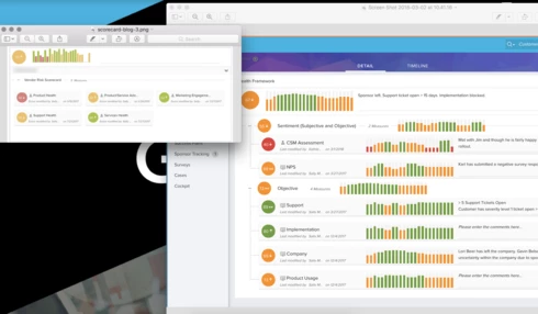
It is good to have the more informative trends for each scorecard component but I think it is the harsh colour pallet of red / amber / green that make this screen not so nice to look at.


I have attached a comparison between the two and believe that we could optimise the colours used but am keen to see what others think.


I can understand where you are coming from Sam! With Scorecards 2.0, we have essentially taken the 3 possible views of Scorecards 1.0 and made them 1 instead of 3. I do appreciate the boldness of the 2.0 colors. The 1.0 had a little opacity to them which was ok, but I like how it was removed in 2.0.