Adoption Explorer is one of the most powerful features Gainsight has to offer. It allows you to analyze your data so deeply that you can use Adoption Explorer to identify upsell opportunities, drive strong adoption to your product, identify potential product gaps, and much more.
This tutorial will provide you five hands-on use cases that can either help get you started with Adoption Explorer or add to your repertoire if you’re already using it!
Keep in mind, this tutorial assumes you have strong usage data to import into Adoption Explorer. If you don’t, consider looking into Gainsight PX.
Use case 1: Compare aggregations on a metric from the past 30 days to that same aggregation for a metric from the previous 90 days using aggregation builder.
This capability is a new enhancement from our 6.18 release. You are now able to build formulas on aggregated data within Adoption Explorer (previously, you were not able to apply custom aggregations).
For example, you might wish to allow users to see the SUM of page views from the past 30 days and compare that to the SUM of page views from the previous 30 days. Or, if you’re comparing against a larger time span, it might make more sense to look at the AVG page views from the past 30 days and compare that to the AVG page views from the past 90 days. Either example (and more!) are now possible with the new aggregation builder.
Use case 2: How exactly are your users using a certain feature?
In this example, let’s dig into our own product - Gainsight - and show how we were able to leverage PX to get a granular view of C360 and Cockpit usage. We’re not limited to just seeing overall C360 clicks and Cockpit clicks, we can see exactly what actions are taking place and what sections are being viewed. You can also create widgets at the top of the layout to quickly digest total page views for example.
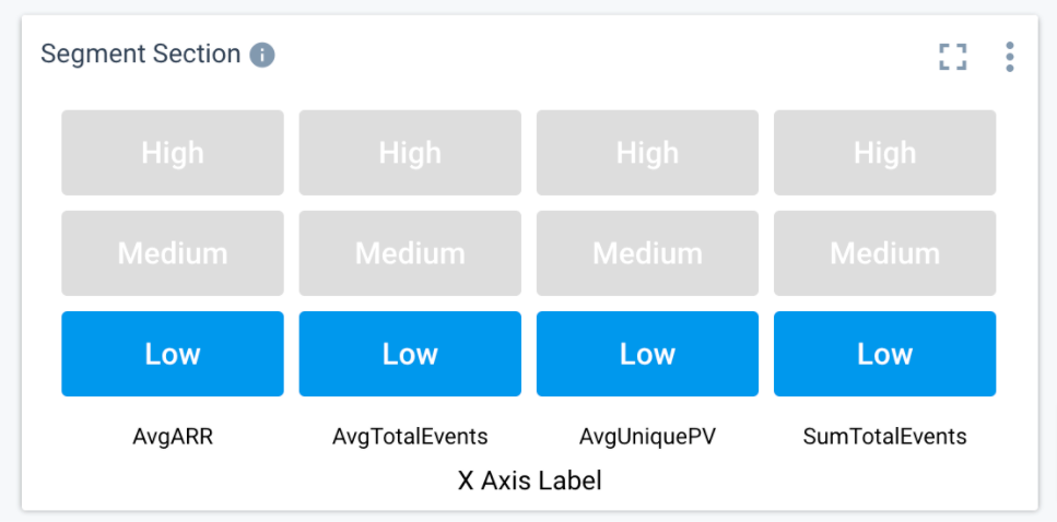
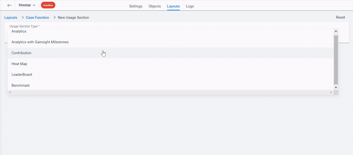
Use case 3: Build a sticky feature heat map to see which features are working and which might need your attention.
Adoption Explorer’s Heat Map functionality allows you to easily see how a customer “measures up” to your expectation. An example of how you can use this effectively is to first set up what’s called “derived dimensions” where you’re able to set thresholds of what you’re expecting to see - think very similar to how you might have set up Red, Yellow, Green scorecard thresholds.
See below for an example of this.
Use case 4: Based on sticky features, say, you want to find how one of your customers compares to overall customers or you want to group your customers (cohort) and want to check which group of customers are using them and which group might need your attention. The idea is to see if your customer needs help or to identify which group of customers needs attention on which parameter.
Adoption Explorer’s Trend Lines, Benchmark Analytics, and Grouped Contribution Analytics, which is an extension of Heatmap, helps you do just that. An example of how you can use this effectively is to first set up which metric you want to create a benchmark over all your customers or a specific group of customers.
Let’s start with a simple Trend line, set a goal, and track if the metric trends above or below that goal. The Goal could be something like min or max thresholds for that metric
Assume you want to measure a metric Exit rate of a page per Month and have created the Monthly trend chart. As part of the goal, you have a Min, Max, and a Benchmark value that you have set and want to see how customers have trended as per those goals. Using Trend lines in the options, we can set the goal values and then see how trends map to these goals.
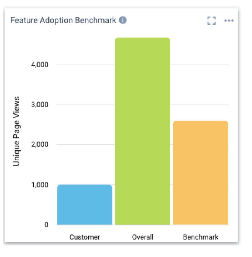
A Benchmark report is the next type of report you can create, which measures how one customer compares to the aggregated value(SUM, MAX, AVG, etc) of the metric compared to other customers. For example, you want to compare the Total Licensed Seats of one customer compared to say Average of overall customers. You can also create your own cohort of customers and compare to the aggregated metric of that group.
A report like below showing unique features used by a customer compared to overall or specific group of customers would indicate that there is higher engagement of the product needed from that customer and start the conversations of what more can be done or used in the product by that customer.
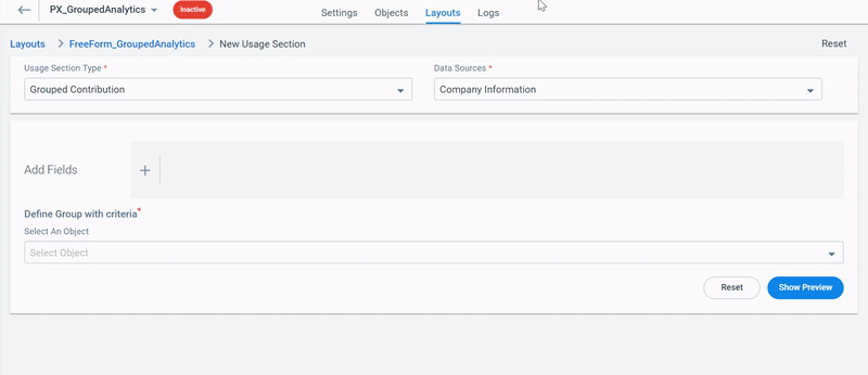
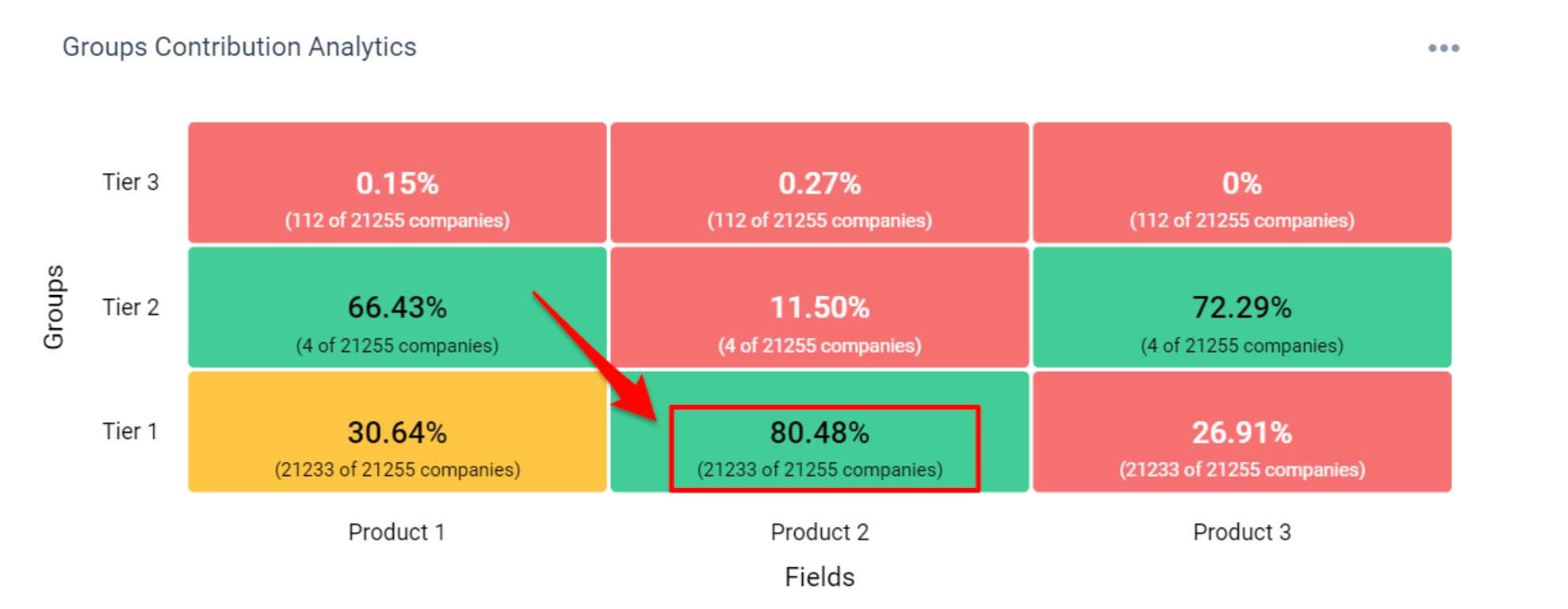
Another chart type is a grouped contribution chart which allows admins to create cohorts like Tiers of your customers and see how each Tier contributes. In the example below, we have 3 Tiers of customers and we want to see how these customers contribute to the Feature usage of 3 sticky features identified.
A report like below shows that our immediate priority to drive adoption is Tier 1>Product 3 , Tier 2 > Product 2 and Tier 3 in general. Thus driving insights of what needs to be driven as a Product adoption champion across customers.
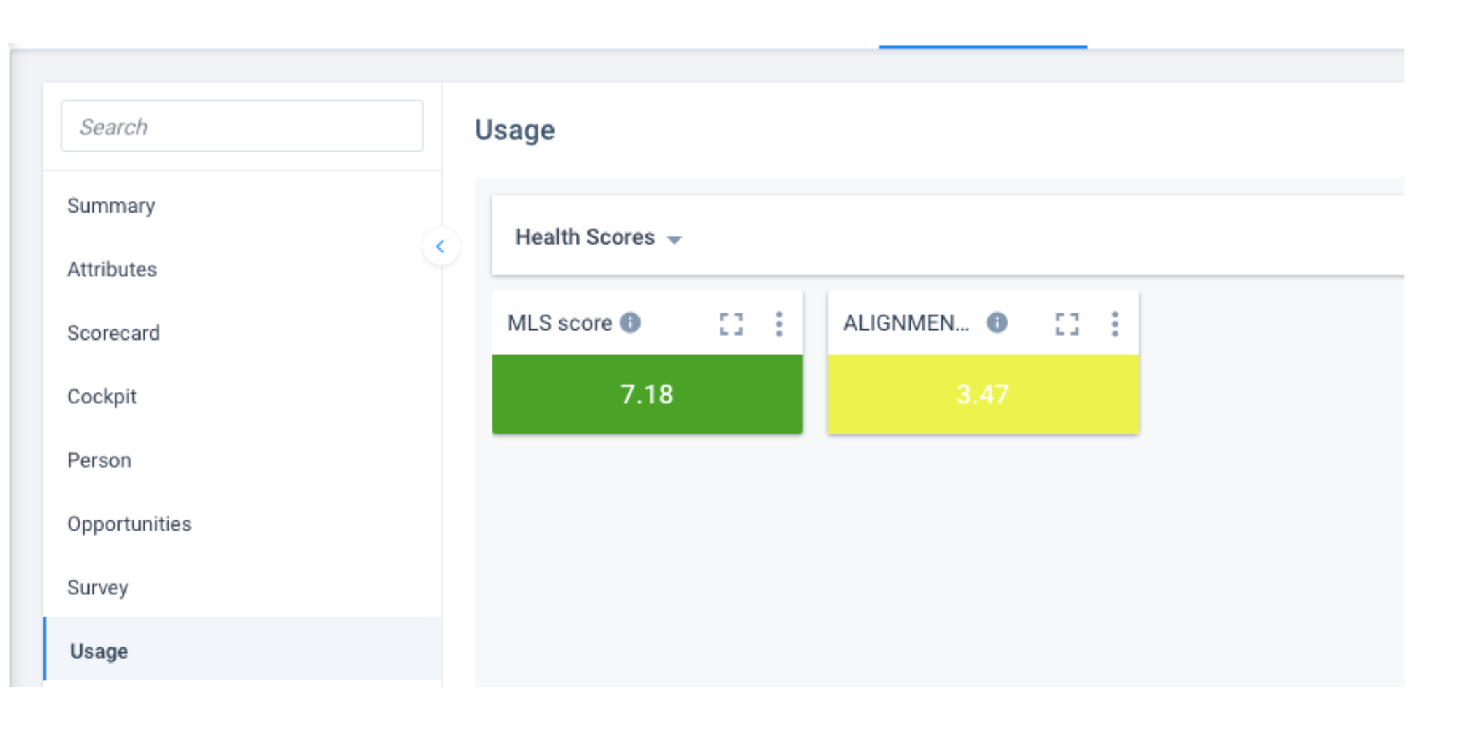
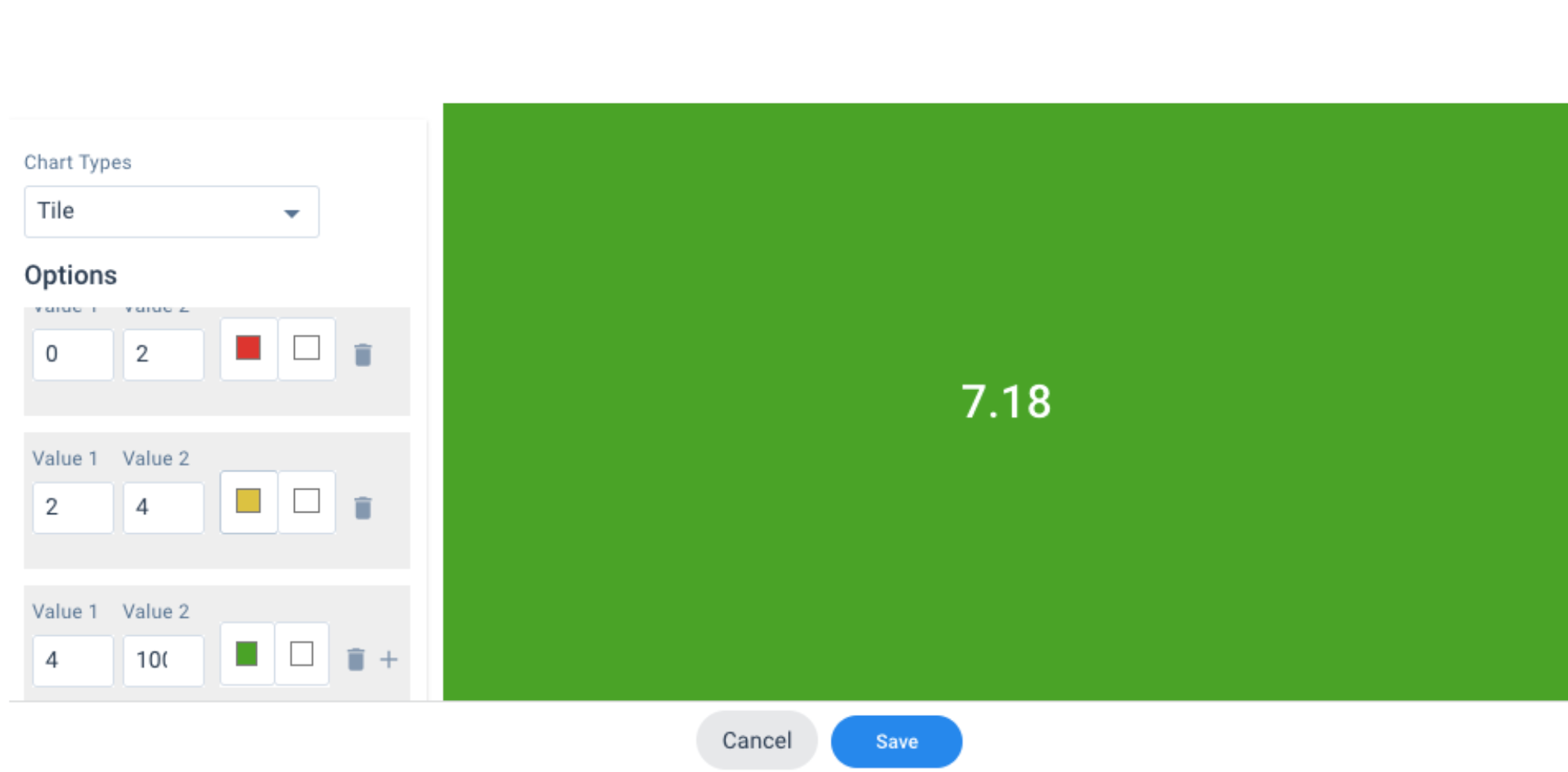
Use case 5: Do you know that there is a simple way of setting whether a customer is trending red, yellow, or green on a dashboard before we even set Health scores? Once this makes sense, we can set the health scores of the customer appropriately.
Adoption Explorer has this feature where on a Tile-type report, you can set values like
if the value of a metric is between 0 to 2 then, RED. between 2 and 4 - YELLOW and anything above is GREEN.
This usage dashboard (Layout) when viewed from C360 shows something like this.