
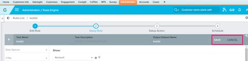
Regarding Rules Engine Task creation UI
None
In the Setup Rule UI, once the initial Dataset task is saved, to add one more task to the rule the user needs to click Cancel, which is weird. Cancel should generally be used to cancel an action rather than creating a new one. We should have a different UI label here. Can this behavior be changed for better usability?

Sign up
If you ever had a profile with us, there's no need to create another one.
Don't worry if your email address has since changed, or you can't remember your login, just let us know at community@gainsight.com and we'll help you get started from where you left.
Else, please continue with the registration below.
Welcome to the Gainsight Community
Enter your username or e-mail address. We'll send you an e-mail with instructions to reset your password.
To add another task, the user can click on "<--" button next to task name. Although Cancel does the same, but the purpose of cancel is to get rid of any unsaved changes. We can definitely think of a better UI. Thanks for bringing it to our notice.
Thanks,
Jitin
We could probably add another action button that let the user takes to adding another task. Let us know!
One of the reasons why we probably went with current placement is to give the user enough space to see the maximum current tasks details. Instead of having a add task button on the top of the task header(Above the name description bar).
Thanks!
I agree on navigating user back to the rule overview with flowchart.