
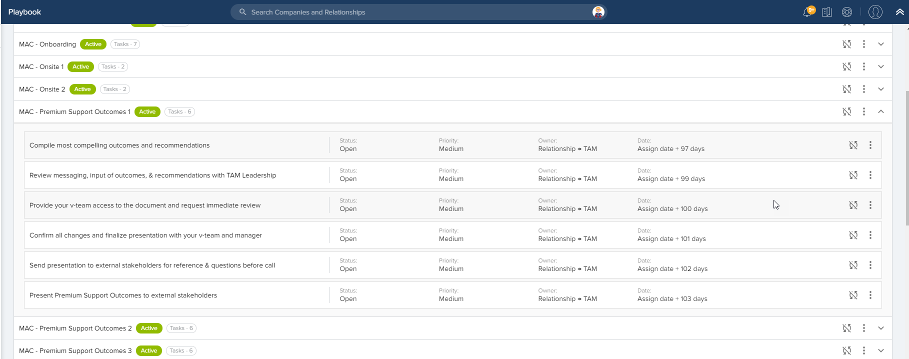
We just recently migrated to Gainsight NXT from Gainsight classic. I have to say, the playbooks and success plan templates interface is a let down. The new look is extremely taxing on the eyes. It is much more difficult to interact with and I lose track of where I am on the screen when editing tasks. The hover highlight color is also very faint. I found it seems to change a little bit when I move between different monitors (on one screen it is grey, on the other it is off white).
NXT
Classic
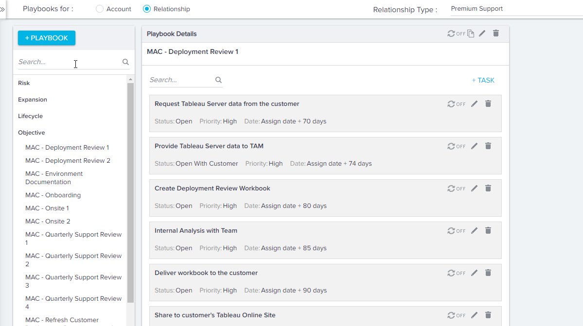

Additional enhancements for playbooks. When we were creating a success plan with objectives and playbooks, we realized that all objective playbooks have to be under the category “all”. Well, this can get messy as the “All” playbooks are also displayed under any CTA type created. It creates a long list that is cumbersome to shuffle through for the playbook you are looking for.
For efficiency, my suggestion would be to add specific objective categories or allow multi-select categories for each playbook to allow more flexibility on where activities can be present.
Best Regards,
Darshana Shah
ADP
+1, the current UI requires way too much clicking and scrolling, especially when creating a new playbook. Currently if I create a new playbook, I have to create it, find it amongst all the other playbooks, and then adding each task which takes at least 3-4 clicks.
I agree with the commentary above.
We’d like this to be more streamlined with a little less death by 1000 clicks to achieve our outcomes. Great feedback above!
We agree with the UX problems in playbook. We will be revamping playbooks as a part of Horizon experience in the medium term. Thanks for all the feedback.