
After our last update, we reworked the way that reports show on dashboards and report builder. Namely, we no longer rescale the report once certain legends are removed or added back to a report.
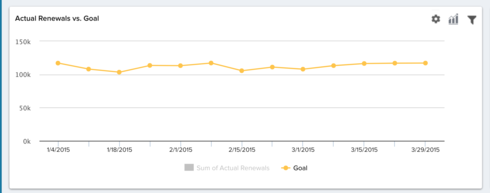
In previous releases, customers could adjust reports by removing one element from the report, and the rest of the report would be rescaled to reflect this change. For example, in the below report from my Demo Org, once the bars are removed, the line remains a bit compressed.
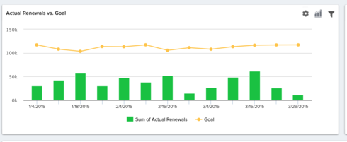
After de-selecting the bar chart portion:
This affects the readability of reports and changes certain functionality that some customers were used to!
It seems that redrawing the report after removing legends or adding an "Apply" button like we have in report builder would give users the option of having this graph rescale to the changes made.
Thanks for your time!
Logan Thome

However, this new release now locks in the Y-axis based on the entire pool of data presented by all labels. Selecting just one label, will not rescale the data.
This means when I have two labels (segments), A is trending btw 100-200, B is trending btw 10000 -15000, by selecting just A, I will essentially see a pretty flat line without any peaks and valleys. This is utterly unhelpful.
Please bring the auto-rescale back so that we actually understand the movement of each trend line. Thanks.
Now, we would not be able to see the movements for most of the labels, if one of them has a much higher absolute number range. It dominants the Y-axis.
I understand the new release is supposed to help the use case where a client may have 20-30 or more labels. And they don't want to deselect it all in order to zoom in onto just one. Makes sense.
But why this enhancement will have to take away the flexibility of the trending, and penalize those who don't have extremely high # of labels? I could be wrong, but I would assume the use case for small labels is more common than that for too many labels. The tradeoff doesn't make sense.
Please bring back the y-axis rescale function in the reporting. Thanks.