Question

Stacked Column Chart - Flexibility in the 'By' when Date is involved

  • 29 December 2016
  • 4 replies
  • 56 views

Badge
Hi - I am trying to create a stacked column chart that shows the monthly breakdown of registrations as part of a larger whole for a few different types of activities. I can get the right data in the chart:


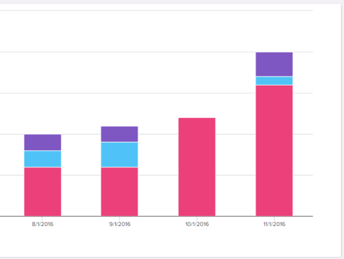
What I want is to change the orientation so that the category runs across the X access and the months are represented going up the column. However, the By will only let me have the date as the first item. Is there any way to change this orientation?

4 replies

Badge +3
Elizabeth - have you tried using a stacked bar vs stacked column?  Not exactly what you are asking but will that work?


I think what you are probably asking is for the count within the column to be grouped by date vs by category - right?
Badge
Hi Denise - Thanks for the quick response. Yes, the stacked bar changes the orientation but it has the same limitations regarding how the data would be grouped. I want the categories to be the first grouping across the X and the count within the column to be grouped by month.
Hi Elizabeth, Unfortunately there is a limitation (due to performance) that requires first aggregation to be on date. If this data is in MDA we can show the data in tabular format (not stacked chart yet, but can look into adding). But for data in SFDC this is a limitation. 
Badge
Thanks Guarav - The data we are analyzing is MDA, but the tabular view doesn't really give us what we need. One problem is that the date doesn't sort chronologically when the category is sorted first. The second is that we don't see the total.  What I'm trying to get to visually is to show a point-in-time value (month) against a total year-to-date. For efficiency sake, I'd like to show that for multiple categories in a single chart (hence the stacked column). I'm also struggling to show the month against YTD on a one-by-one basis if you have any ideas.

Reply