
Y’all changed a vital chart, and actually removed important information and did not replace it.
This is a monthly chart. You used to show how this chart looked vs. the previous equal timeframe. That is now gone. I’m not sure I care about these new values, and they’re organized oddly. Aside from missing data, I have to think far more than I should every time I look at this thing.
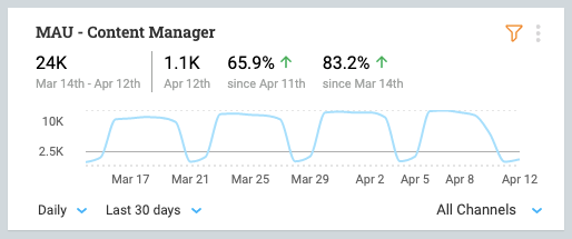
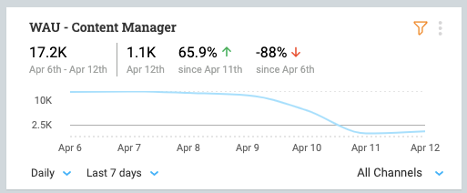
Sunday is down 88% since last Monday? Well no kidding. Show me change vs. equal day of week. Show me change vs. previous 7 days.
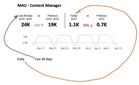
GIve me something like this.

Thank you@alb will certainly make adjustments.
In Daily we should simplify for sure.
If you’re using 30 days, it might make sense to use monthly:
On weekly and monthly scopes the goal is to show the entire trend date range (last 8 or 12 weeks) and then to surface the:
We’re considering to move the 2 middle to the right side
We’ve added the global trend back, we will have another iteration where we offer different view options (compact, full)
We’ve added the global trend back, we will have another iteration where we offer different view options (compact, full)
Thanks@mickey , That switch between compact/full would be really good to have. I have a hard time explaining the different percentages to team members and management, who are not frequent PX users.