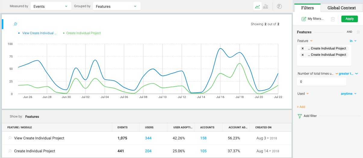
The line in blue represents the first step, which is to view the page for creating an activity (one of our primary features). The line in green represents the final step, which is to actually create the activity. There are several required steps in between that I chose to not include here.
If I wanted a more granular view, i.e., all the pages viewed and buttons clicked in between the first and last step, I would have chosen to answer this question in Path Analyzer. In this instance, we just wanted the bird's eye view of feature pull-through over time.
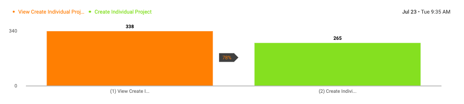
If I wanted to remove the time component from the X axis, I could use Audience > Funnel view. This view is one that I could use some help understanding further.
Is the Y axis measuring events or unique users? In other words, is this view telling me that:
- 78% of users who "View Create Individual Project" (orange) go all the way through to "Create Individual Project" (green)? OR
- 78% of the time, the event "View Create Individual Project" (orange) is followed by the event "Create Individual Project" (green)? (i.e., not factoring in whether 1 user did this over and over, therefore spiking the pull-through)