
This thread is for the Admin Office Hours session for Thursday April 20th,
2017. Submit your questions to this thread and we'll address them during our session at 11am PST / 12pm MST / 1pm CST / 2pm EST.
To register for this session, please click here.
Admin Office Hours - April 20th, 2017

Graphs with Custom Colors:
I need help building a Graph that SHOWS the Count of Accounts & Sum of ACV BY each CSM where the Score Label is Red. I need the graph to display the "Current Score Label" as a Red color.
I have clicked Color Configuration, I selected the "Customer Info" object and selected the “Current Score Label” as the field to be displayed as Red in my Dashboard.
SHOW ME: Account Name; Sum of ACV
BY: Cloud CSM; Current Score Label (<- Current Score Label must be included or else graph won’t be red).
Visualization Type: Column OR Column Line
Report Name = “Risk - Count and ACV of all Customers with Red Health”
The fact that I must include “Current Score
Label” in the “BY” section limits the number of Visualization Types I can choose from. Is there a way to SHOW: Count of Accounts; SUM of ACV
BY: Cloud CSM; Current Score Label as a Column or Column Line graph?
I would like the graph to match the attached image, but instead of Blue I want it to show Red.
If i add "Current Score Label" to the BY section, the visualization type in the image cannot be selected.
This is the challenge I am passing on to the Gainsight Guru's. Good Luck.
Thanks,
I need help building a Graph that SHOWS the Count of Accounts & Sum of ACV BY each CSM where the Score Label is Red. I need the graph to display the "Current Score Label" as a Red color.
I have clicked Color Configuration, I selected the "Customer Info" object and selected the “Current Score Label” as the field to be displayed as Red in my Dashboard.
SHOW ME: Account Name; Sum of ACV
BY: Cloud CSM; Current Score Label (<- Current Score Label must be included or else graph won’t be red).
Visualization Type: Column OR Column Line
Report Name = “Risk - Count and ACV of all Customers with Red Health”
The fact that I must include “Current Score
Label” in the “BY” section limits the number of Visualization Types I can choose from. Is there a way to SHOW: Count of Accounts; SUM of ACV
BY: Cloud CSM; Current Score Label as a Column or Column Line graph?
I would like the graph to match the attached image, but instead of Blue I want it to show Red.
If i add "Current Score Label" to the BY section, the visualization type in the image cannot be selected.
This is the challenge I am passing on to the Gainsight Guru's. Good Luck.

Thanks,
Userlevel 4
Distributing Gainsight Risk dashboards to Sales Leaders that are used to looking at only Salesforce pages.
We're looking to "push" more information to our sales organization and our leaders are used to looking at their salesforce dashboards for key information they need. If I've created a risk dash in Gainsight, my fear is they won't see it and forget to drill down to it. Is there a way to link Gainsight dashboards back to the Salesforce dashboards page - even if it's just a picture link?
Looking forward to hearing all discussions.
Userlevel 4
Another Dashboards question:
Our geographical levels go Region >> Territory. Is there a way we can use global filters to have a multiple selection criteria? I.e. I select the East region where there are 16 territories, however I want to select only 4 of them. There is no good level in between as our account reps are 1 to 1 to territories for the most part.
Thanks!
Hi Johnny,
We don't support custom colors for more than one show fields. If we provide this option, graph will look inconsistent.
Here is an example:
SHOW ME: Account Name, Sum of ACV
BY: Current Score Label
On setting color red for one of current score label value, graph will be draw one red bar and rest will be blue. It's a inconsistent since some of the lines are drawn as blue and some as red.
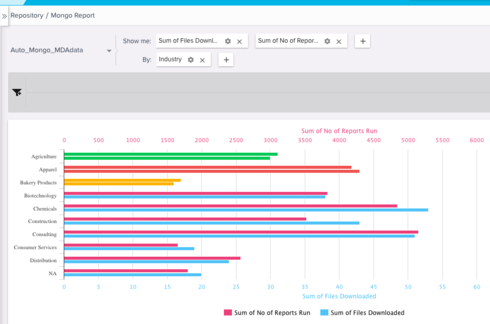
One more example if we enable this feature, graph will look like this (Old image taken from archive):
I see two options :- you can use color palette to set color as red for all the bar or change visualisation to PIE, BUBBLE and SCATTER
We don't support custom colors for more than one show fields. If we provide this option, graph will look inconsistent.
Here is an example:
SHOW ME: Account Name, Sum of ACV
BY: Current Score Label
On setting color red for one of current score label value, graph will be draw one red bar and rest will be blue. It's a inconsistent since some of the lines are drawn as blue and some as red.
One more example if we enable this feature, graph will look like this (Old image taken from archive):
I see two options :- you can use color palette to set color as red for all the bar or change visualisation to PIE, BUBBLE and SCATTER
Reply

Sign up
If you ever had a profile with us, there's no need to create another one.
Don't worry if your email address has since changed, or you can't remember your login, just let us know at community@gainsight.com and we'll help you get started from where you left.
Else, please continue with the registration below.
Welcome to the Gainsight Community
Enter your username or e-mail address. We'll send you an e-mail with instructions to reset your password.