
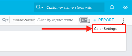
Karl Rumelhart mentioned customized color scheme for graphs during the Product Roadmap showcase at Pulse, is this something that'll be made available to the Early Access customers?
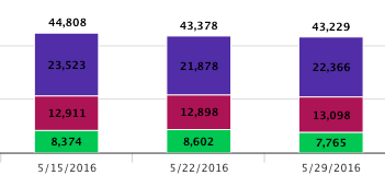
Pre-5.0

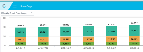
5.0

 +10
+10


 +2
+10
+2
+10
 +3
+3
+3
+3
If you ever had a profile with us, there's no need to create another one.
Don't worry if your email address has since changed, or you can't remember your login, just let us know at community@gainsight.com and we'll help you get started from where you left.
Else, please continue with the registration below.
Enter your username or e-mail address. We'll send you an e-mail with instructions to reset your password.
