
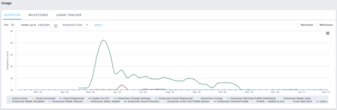
Trying to find a way to readjust how the usage graph's default Y axis is values.


I am trying to find a way to readjust how the usage graph's Y axis is set. It seems to change automatically change the default Y axis values depending on the usage it finds but it typically does not represent the data very well. Is there a way to change this?

Userlevel 7
 +3
+3
I don't believe this is possible Ky though I haven't checked the February release to see if this has changed. I agree it's frustrating.
Not for February, but for Spring (April / May) we have functionality to manually set Y-axis for report 2.0 reports.

Userlevel 6
 +7
+7
anything new on this?
Reply

Sign up
If you ever had a profile with us, there's no need to create another one.
Don't worry if your email address has since changed, or you can't remember your login, just let us know at community@gainsight.com and we'll help you get started from where you left.
Else, please continue with the registration below.
Welcome to the Gainsight Community
Enter your username or e-mail address. We'll send you an e-mail with instructions to reset your password.