
Admittedly this is a bit of a shame request, but I think there’s real room for improvement here:
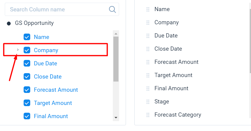
When adding fields to a View on the Forecast Table of Renewal Center, the UI to add fields doesn’t match the rest of the product. I completely missed this microscopic carrot to expand Company and see some new fields I’d added in Administration (see below).
The request here is to have this area match the rest of the product on how fields and lookups are represented when adding them to reports. Think Data Designer and Report Builder - very noticeable + next to lookups, and lines to show what level you’re at.

Thanks! I would also point out that it’s not even consistent with the rest of Renewal Center. This is a screenshot from where you set up Global Filters: