
Possibly the worst first time experience at the moment on CS is that the first tab in the menu is AE (Unless CX Center is available). I strongly believe that Adoption Explorer should live in Administration.
And if not, then it has to be moved lower than Cockpit, Timeline etc. As a first time user will admin access you are going to click into AE and have a bad experience.
PX is currently doing an A* job of this.
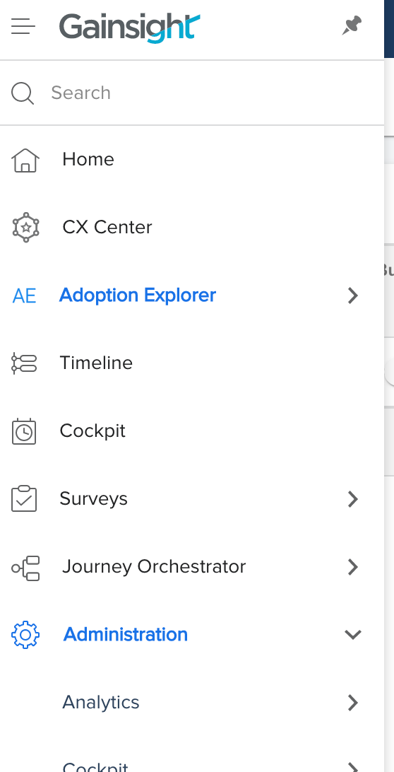

I cannot judge your comments, but I can say that I would like to see the Cockpit and Timeline moved to the first(highest usage).
I would like to take other customers inputs as well. @All, please leave your comments here and show the absoluteness to change the order.
I would agree that the way the Navigation bar is currently oriented isn’t intuitive or seem to be organized in any logical order. I also agree that organizing end-user functions, like Timeline, Cockpit, Home (Dashboards) to the top and moving more administrative functions (JO, AE, Surveys) to the bottom, or under the Admin menu would help with this.
Another thing I’ve seen other sytems do to great effect: allow users to “Favorite” menu items so they show top of list, or are always available somewhere on the screen. Maybe this would be unnecessary with a reorganization, but throwing it out there as an additional thought.
Any input on this one@ciarapeter ?
Thanks for copying me - looking into this now.
Adding@ophirsw to this UX convo