
This is purely about the visuals, not a commentary on when data points do or do not show up. Right now, using data points for reports on dashboards is a really tough sell.
Problem: In the below example, this is not a particularly busy graph, however the line and column values overlap with each other and make it pretty useless.
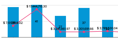
Because the experience is so hit or miss on when it is readable and when it is not, it’s almost not worth having the feature enabled at all, as your data may show up fine one day but as data refreshes it may result in something like this. If this is addressed in the new report/dashboard rollout, I will believe it when I can use it :)
Solution: There should be more “awareness” between the location of where the values are placed on the primary and secondary y-axis. There should never be any overlap, and in general more consideration should be given on the readability of the data: Font size, kerning, font color on light vs dark backgrounds, etc.

Thank you! Someday I will be among the fortunate to see for myself :)