Solved

2 column copilot email template ... How todo this?

  • 20 April 2016
  • 5 replies
  • 343 views

Hi There 

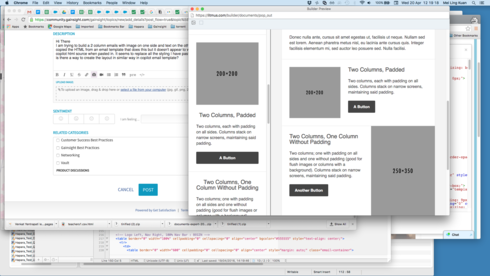
I am trying to build a 2 column emails with image on one side and text on the other. I have copied the HTML from an email template that does this but it doesn't appear to work in the copilot html source when pasted in. It seems to replace all the styling I have pasted it. Therefore is there a way to create the layout in similar way in copilot email template? which in mobile the 2 columns will rearrange to image at the top and the text below the image as per the image in the left panel. 


icon

Best answer by m_l_kuan 25 May 2016, 05:50

View original

5 replies

I have figure it out using Table html to build 2 columns responsive email template in co pilot. here is the html code with a header and footer.

<!-- background table --><table id="bgtable" align="center" border="0" cellpadding="0" cellspacing="0" height="100%" width="100%">

    <tr>

        <td align="center" valign="top">

            <!-- container 600px -->

            <table border="0" cellpadding="0" cellspacing="0" width="600px" style="...">

<!--------------- HEADER ----------------------------------------------------------------------------------------------------------------------------------->

<tr>

      <td height="10" style="font-size: 0; line-height: 0;">&nbsp;</td>

</tr>

                <tr>

                    <td align="left">

                       <img src="http://www.gainsight.com/wp-content/uploads/2015/09/logo.png"/>;

                    </td>

                </tr>

<tr>

      <td height="10" style="font-size: 0; line-height: 0;">&nbsp;</td>

</tr>

<tr>

      <td height="10" style="font-size: 0; line-height: 0;">&nbsp;</td>

</tr>

<!--------------- START CONTENT ----------------------------------------------------------------------------------------------------------------------------------->

                <tr>

                    <td valign="top">

<!-------------- SINGLE COLUMN ----------------------------------------------------------------------------------------------------------------------------------->

<table border="0" cellpadding="0" cellspacing="0" width="600px" align="left" >

<tr>

       <td align="left"><!-- REMOVE ANY PADDING FROM TD -->

           <table align="left" border="0" cellpadding="0" cellspacing="0" style="display: inline-block;" width="600px">

               <tr >

                   <td align="left" valign="top" style="padding: 5px;20px;5px;">

<strong style="font-weight: bold; box-sizing: border-box;color: rgb(45, 43, 126); font-size: 24px; font-family: Arial;">Hello</strong>

</td>

               </tr>

               <tr>

                   <td align="left" valign="top" style="padding: 5px;20px;5px;" >

<p style="box-sizing: border-box; padding-top: 0px; padding-bottom: 0px; margin: 0px;color: rgb(96, 96, 96); font-family: Arial;">

Various versions have evolved over the years, sometimes by accident, sometimes on purpose (injected humour and the like).

</p>

</td>

               </tr>

           </table>

       </td>

   </tr>

</table>

<!-------------- TWO COLUMNS ----------------------------------------------------------------------------------------------------------------------------------->

<table border="0" cellpadding="0" cellspacing="0" width="600px"  align="center"  >

<tr>

       <td>

&nbsp;

</td>

</tr>

<tr>

       <td align="center"><!-- REMOVE ANY PADDING FROM TD -->

           <!-- LEFT TABLE -->

           <table align="left" border="0" cellpadding="5px" cellspacing="0" style="display: inline-block;" width="300px">

               <tr>

                   <td  style="padding: 5px;20px;5px;">

<center style="box-sizing: border-box;"><strong style="font-weight: bold; box-sizing: border-box; word-break: break-word;color: rgb(96, 96, 96); font-family: Arial;">

title

</strong></center>

</td>

               </tr>

               <tr>

                   <td  style="padding: 5px;20px;5px;">

<p align="justify" style="box-sizing: border-box; padding-top: 0px; padding-bottom: 0px; margin: 0px;color: rgb(96, 96, 96); font-family: Arial;">

It is a long established fact that a reader will be distracted by the readable content of a page when looking at its layout. The point of using Lorem Ipsum is that it has a more-or-less normal distribution of letters, as opposed to using 'Content here, content here', making it look like readable English. Many desktop publishing packages and web page editors now use Lorem Ipsum as their default model text, and a search for 'lorem ipsum' will uncover many web sites still in their infancy. Various versions have evolved over the years, sometimes by accident, sometimes on purpose (injected humour and the like).


</p>

</td>

               </tr>

           </table>

           <!-- RIGHT TABLE -->

           <table align="left" border="0" cellpadding="0" cellspacing="0" style="display: inline-block;" width="300px">

               <tr>

                   <td align="center" style="padding: 5px;20px;5px;" width="300px">

<img src="http://www.gainsight.com/wp-content/uploads/2015/09/logo.png"/>;

</td>

               </tr>

           </table>

       </td>

   </tr>

<tr>

       <td>

&nbsp;

</td>

</tr>

   </table>


<!-------------- SINGLE COLUMN ----------------------------------------------------------------------------------------------------------------------------------->

<table border="0" cellpadding="0" cellspacing="0" width="600px" align="left" >

  <tr>

       <td>

&nbsp;

</td>

</tr> 

<tr>

       <td align="left"><!-- REMOVE ANY PADDING FROM TD -->

           <table align="left" border="0" cellpadding="0" cellspacing="0" style="display: inline-block;" width="600px">

               <tr>

                   <td align="left" valign="top" style="padding: 5px;20px;5px;" >

<p style="box-sizing: border-box; padding-top: 0px; padding-bottom: 0px; margin: 0px;color: rgb(96, 96, 96); font-family: Arial;">

Best regards,

</p>

<p style="box-sizing: border-box; padding-top: 0px; padding-bottom: 0px; margin: 0px;color: rgb(96, 96, 96); font-family: Arial;">

the team

</p>

</td>

               </tr>

           </table>

       </td>

   </tr>

   <tr>

       <td>

&nbsp;

</td>

</tr>

</table>

<!--------------- START CONTENT ----------------------------------------------------------------------------------------------------------------------------------->


                    </td>

                </tr>


<!--------------START FOOTER ----------------------------------------------------------------------------------------------------------------------------------->

                <tr>

                    <td align="center" valign="top">

<!-------------- SEVEN COLUMNS ----------------------------------------------------------------------------------------------------------------------------------->                    

                        <table border="0" cellpadding="0" cellspacing="0" width="600px"  align="center" style="border: 1px solid rgb(238, 238, 238); background-color: rgb(238, 239, 239);" >

<tr>

       <td align="center" width="100%">

           &nbsp;

       </td>

   </tr>

<tr>

       <td align="center" width="100%">

          placeholder for social icons

       </td>

   </tr>

    <tr>

       <td align="center" width="100%" style="padding: 5px;84px;84px;5px;">

           <p style="box-sizing: border-box; padding-top: 0px; padding-bottom: 0px; margin: 0px;color: rgb(96, 96, 96);font-size: 10px; font-family: Arial;">

   company address and details

</p>

       </td>

   </tr>

   <tr>

       <td align="center" width="100%" style="padding: 5px;84px;84px;5px;">

           <p style="box-sizing: border-box; padding-top: 0px; padding-bottom: 0px; margin: 0px;color: rgb(96, 96, 96);font-size: 8px; font-family: Arial;">

   Image Credits ........

</p>

       </td>

   </tr>

   <tr>

       <td align="center" width="100%">

           &nbsp;

       </td>

   </tr>

    <tr>

       <td align="center" width="100%">

           &nbsp;

       </td>

   </tr>

   </table>

<!--------------END FOOTER ----------------------------------------------------------------------------------------------------------------------------------->


                    </td>

                </tr>

            </table>

            <!-- container 600px -->

        </td>

    </tr>

</table>

<!-- background table -->
https://www.arclab.com/en/amlc/how-to-email-newsletter-templates.html this article prove div is not support html tag to be used in email template
Are we able to add @media css into the Gainsight email template. It seems like that is the common practice of email campaign tools use to control display of html content in different devices. 


Div is definitely not a standard html to be used for email clients as far as i understand.
 Tejeswara Rao Raavi thanks for this but i though Div is generally not supported by most emails clients. e.g. 

https://www.campaignmonitor.com/blog/email-marketing/2011/05/div-tags-in-html-email-newsletters/

..


could you let me know if this work at all for the email clients listed in the above article?
I was quickly able to hack this using HTML code and here is a sample  that shall help you.


Sample Html :


<div style="display:inline-block"><div style="float:left;width:266px;margin-top:100px;padding-left:50px;box-sizing:border-box;">

 <img src="http://www.gainsight.com/wp-content/uploads/2015/09/logo..png"/>;

</div>

<div style="float:left;width:250px;">

    It is a long established fact that a reader will be distracted by the readable content of a page when looking at its layout. The point of using Lorem Ipsum is that it has a more-or-less normal distribution of letters, as opposed to using 'Content here, content here', making it look like readable English. Many desktop publishing packages and web page editors now use Lorem Ipsum as their default model text, and a search for 'lorem ipsum' will uncover many web sites still in their infancy. Various versions have evolved over the years, sometimes by accident, sometimes on purpose (injected humour and the like).

</div>

</div>

<div style="margin-top:20px">

    It is a long established fact that a reader will be distracted by the readable content of a page when looking at its layout. The point of using Lorem Ipsum is that it has a more-or-less normal distribution of letters, as opposed to using 'Content here, content here', making it look like readable English. Many desktop publishing packages and web page editors now use Lorem Ipsum as their default model text, and a search for 'lorem ipsum' will uncover many web sites still in their infancy. Various versions have evolved over the years, sometimes by accident, sometimes on purpose (injected humour and the like).

</div>

----------


Reply